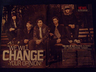
The double page spread I chose, was from the niche magazine "Kerrang!" which started in 1981, a magazine based on the subculture of rock, based about rock bands and reviews, which seems to be aimed at a male audience since males are more "into" rock, and the colours are mainly blue, black, grey and red. The double page spread is a photo shoot and a piece of writing with quotes from the band called "You Me At Six" who are fairly new and of the rock genre. This double page spread's mode of adress suggests that the people reading this interview already know about the band, considering they are fairly unknown in mainstream music, since the band are talking about the new album's new image, without focusing much on their past success. The title is very large, in bold white writing on the bottom on the left page, therefore it stands out, since it is the same size as the text on the alternating page. The title immediatley lets the reader know what the article is about, with five strong words which have been selected from a quote of the band's. The reader knows the article is about the band changing since the word "change" is in the biggest font and the words "we will" are before it making it a strong statment which catches the reader's attention, especially those who are fans of the band. The reader then knows the change is "your opinion", which makes the reader intrigued as to how they are going to change the reader's opinion. This also suggests that perhaps the band have been too mainstream before therefore not being taken seriously by the rock fans who the magazine attracts. It is obvious this article is going to be informing, since the text is very small, white font in the bottom corner of the right page, and it does not look very appealing to read, therefore the reader must want to get information out of the text, the same as how the reader buys the magazine because they have an interest in the music. As the reader then reads the text, it becomes clear the aim is to inform of how the band had made their new album, what it will include and how it contrasts to their previous album, therefore not including any gossip or exciting information. There is a picture of the band which takes up the two pages, which is of the five band members all wearing dull coloured clothing with fairly serious facial expressions to rebuke the message of changing their pop-punk image into serious rock artists. There is a small, black box in the top right corner which has the word "news" in capital red letters, with the website adress underneath to advertise their other platform. On top of the small text space there is a heading in the same white font, but fairly bigger in order for the reader to understand who the band is from the name being included in text which expands from the hending, this lets the reader decide whether they are interested enough in this particular band to read on. This text explains the article is about the band shaking off "their pop-punk 'stigma'" which again appeals to the music fans since it is not about gossip, it is about music. The dull colours in the picture and white font create a serious and slightly depressive feel to the spread in order to appeal to the readers who are fans of rock which is famous for it's sometimes dark songs and who view themseleves as 'cool' people who have no need for colours to express their moods. The artists are represented as being serious artists, which is what the audience is about, therefore they start to be taken seriously, as artists who are taking a new rock approach to their music. At the end of the article in bolder writing, but the same sized font, there is information of the band's upcoming touring which increases fandom and there is also a date and website where the reader can downlode the band's new song which again increases fandom and interest. The interview works well in the print platform because it still keeps some of the original newspaper print seen in magazines such as "New Musical Express", or the rock fanzine which emerged in 1960. Although if the interview was done on their website it may have been equally effective since fans visit the website a lot, although the band may have seemed less important if they had not been in the main magazine and the dull layout would not have worked as well on the internet. Overall, the artists have succeded in making rock fans start to become interested in their music, since they used the conventions of the magazine form to impose their new image.
Subscribe to:
Post Comments (Atom)


No comments:
Post a Comment